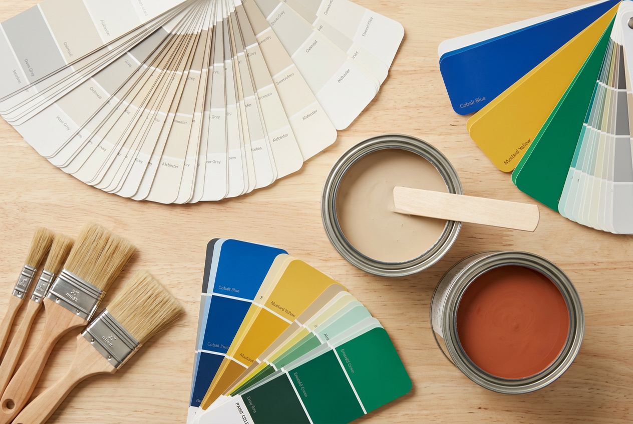
Choosing a white paint sounds simple — until you're staring at dozens of swatches and wondering why some look creamy and others look almost blue. Understanding the difference between warm white and cool white is one of the most useful things you can do before picking up a brush. Get it right and your rooms will feel exactly as you intended; get it wrong and even a freshly painted space can feel off.
What Makes a White Paint 'Warm' or 'Cool'?
All white paints contain a base pigment plus small amounts of other colours that shift the overall tone. Warm whites lean towards yellow, red, or orange undertones — think cream, ivory, or off-white. Cool whites lean towards blue, green, or grey undertones, giving a crisper, cleaner appearance.
This is closely related to the concept of colour temperature, measured in Kelvins when talking about light. Paint manufacturers use similar language: a warm white feels cosy and inviting, while a cool white feels fresh and modern.
How Undertones Work in Practice
Undertones can be surprisingly hard to spot on a small chip in the shop. Here's what to look for:
- Hold the swatch against a pure white reference (like a white piece of printer paper). Any yellow, pink, or beige shift = warm. Any blue or grey shift = cool.
- View swatches in the actual room at different times of day — morning light, midday, and evening artificial light can all change how a white reads.
- Paint a test patch of at least an A4 size directly on the wall and live with it for 24–48 hours before committing.
Resene offers a huge range of whites and near-whites, and their in-store colour consultants can help you identify undertones. Similarly, Dulux and Wattyl both have extensive white palettes with helpful undertone descriptions on their websites.
How NZ Light Affects Your Choice
New Zealand's light is famously bright and clear, particularly in the South Island and on the coast. Our strong UV and high-angle summer sun can make cool whites look stark or even slightly harsh in rooms with lots of natural light. Warm whites tend to soften this effect and add a sense of comfort.
However, in rooms that face south or get limited sun — common in many older NZ homes with smaller windows — a cool white can actually help the space feel brighter and less dingy, whereas a warm white might make it feel cave-like.
Matching White Paint to Your Room's Purpose
| Room | Suggested Tone | Why |
|---|---|---|
| Living room / lounge | Warm white | Creates a welcoming, relaxed feel |
| Bedroom | Warm white | Promotes calm and cosiness |
| Kitchen | Cool or neutral white | Feels hygienic and fresh |
| Bathroom | Cool or neutral white | Pairs well with tiles and chrome fixtures |
| Home office | Cool white | Supports focus and alertness |
| Hallway (south-facing) | Cool white | Maximises perceived brightness |
Matching White to Your Existing Décor
Your flooring, cabinetry, and soft furnishings all have undertones too. A common mistake is choosing a cool white paint when you have warm timber floors — the contrast can make the walls look dirty or grey by comparison. Conversely, a warm white against cool grey tiles can look yellowed.
- Warm timbers, natural fibres, earthy tones → warm white
- Grey tiles, stainless steel, cool stone benchtops → cool white
- Mixed materials → a neutral white with balanced undertones is often the safest bet
BRANZ research highlights how interior finishes interact with each other and with light reflectance values (LRV), which is worth considering if you're also thinking about energy efficiency and natural light.
Popular NZ White Paint Shades to Explore
Rather than naming specific product codes (which can change), visit the colour tools on Resene, Dulux, or Wattyl and filter by whites. Look for descriptors like:
- Warm: alabaster, linen, cream, antique white, ivory
- Neutral: classic white, quarter white, white on white
- Cool: arctic white, bright white, whisper white (with grey/blue notes)
Most brands sell small testpots — these are well worth the few dollars to try before buying full quantities.
Sheen Level Matters Too
The finish you choose affects how a white reads on the wall:
- Flat/matte absorbs light and softens the tone — good for hiding imperfections on older walls
- Low sheen / eggshell is the most popular all-round interior finish in NZ
- Semi-gloss / gloss reflects more light, which can intensify cool undertones and make a space feel sharper
For wet areas like bathrooms and kitchens, a washable low-sheen or semi-gloss is recommended for durability and compliance with the NZ Building Code's E3 (internal moisture) requirements.
When to Call a Professional
While painting is one of the more DIY-friendly home improvement tasks, there are times when hiring a qualified painter makes sense:
- Large or high areas — working at height carries real risk; check WorkSafe NZ guidelines before using ladders or scaffolding
- New plasterboard — GIB board requires correct stopping, priming, and sealing before topcoats, and mistakes are hard to fix
- Exterior painting — surface prep, weatherproofing, and product selection are critical for NZ's variable climate
- Colour matching and consultation — a professional painter can advise on undertones and save you costly repaints
You can find qualified, local painters on tradedirectory.co.nz — it's a great way to get a few quotes and find someone who knows your region's conditions.