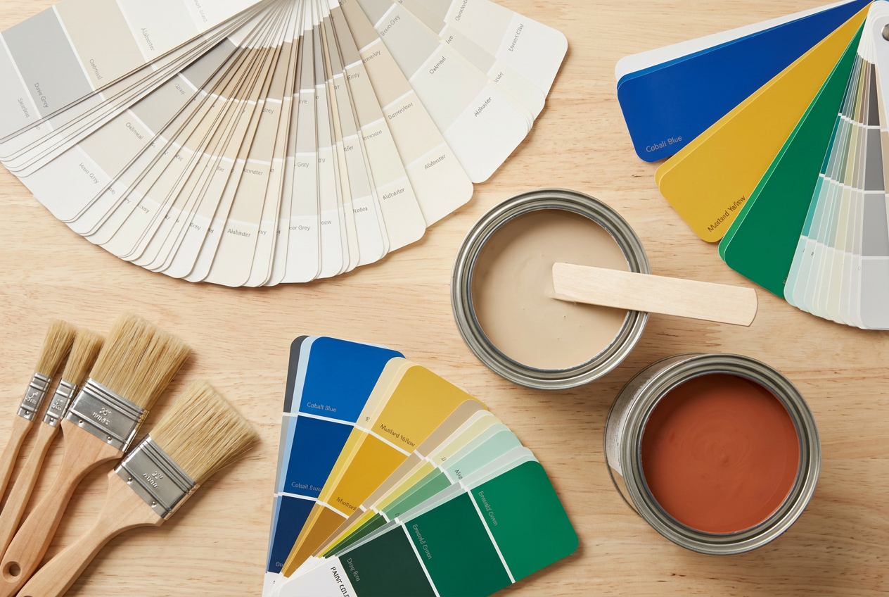
A small room doesn't have to feel cramped — the right paint colour can work wonders. Whether you're tackling a compact Auckland apartment, a Wellington villa bedroom, or a Christchurch sleepout, colour choice is one of the most affordable ways to transform a space. Here's what NZ painters and colour experts recommend.
Why Colour Affects How Big a Room Feels
Colour influences how our eyes perceive depth and distance. Light colours reflect more light, making walls appear to recede and the room feel more open. Dark colours absorb light, drawing walls inward and creating a cosier, more enclosed feel. Understanding this principle is the foundation of every trick in this guide.
NZ homes also tend to have varying natural light depending on orientation — a north-facing room gets plenty of sun, while a south-facing room can feel dim. Always consider your room's natural light before committing to a colour.
The Best Colours for Making a Small Room Feel Bigger
Soft Whites and Off-Whites
Classic white remains the go-to for opening up a small space. However, a pure brilliant white can feel stark and cold, especially in south-facing rooms. Warm off-whites with a hint of cream, linen, or pale grey tend to feel more welcoming while still reflecting plenty of light.
Try browsing the Resene whites and neutrals range — they offer a huge selection of tested NZ colours with free colour swatches from their stores.
Pale Neutrals and Greiges
Greige (a blend of grey and beige) is enormously popular in NZ interiors right now. Shades like soft stone, warm putty, and pale sand add subtle warmth without closing in the walls. These tones work particularly well in open-plan living areas where you want cohesion across a small footprint.
Cool Blues and Soft Greens
Pale, cool blues and soft sage greens can make a room feel fresh and airy — almost like bringing the outside in. These work especially well in bathrooms and bedrooms. Avoid going too saturated; stick to muted, low-chroma versions of these hues.
Dulux and Wattyl both offer colour visualiser tools on their websites, which can help you preview shades in a virtual room before you buy.
Pale Lavender and Blush
Soft lavender and blush tones have a light-reflective quality similar to whites, but with a little more personality. They suit bedrooms and reading nooks particularly well.
Colours to Use with Caution
This doesn't mean dark colours are off-limits — but in a small room, they need careful handling.
| Colour Type | Effect in Small Rooms | Best Used On |
|---|---|---|
| Bright white | Crisp, open, can feel cold | Ceilings, trim |
| Warm off-white | Open, welcoming | Walls, ceilings |
| Pale grey/greige | Modern, airy | Walls |
| Soft blue/green | Fresh, receding | Walls, feature wall |
| Deep navy/charcoal | Cosy but enclosing | Accent wall only |
| Bright, saturated colours | Energetic but visually heavy | Accessories only |
Techniques That Amplify the Effect
Paint the Ceiling the Same Colour as the Walls
One of the most effective tricks is painting the ceiling the same colour (or a slightly lighter tint) as the walls. This removes the hard visual boundary between wall and ceiling, making the room feel taller and more continuous.
Use a Single Colour Throughout
Tonal decorating — using one colour family across walls, trim, and ceiling — reduces visual interruptions and makes a small space feel seamless. This is a growing trend in NZ interiors.
Choose the Right Sheen
Sheen level matters. A low-sheen or flat finish absorbs light and can make a small room feel softer, while a satin or semi-gloss finish reflects more light and can brighten a dim space. For most NZ living areas and bedrooms, a low sheen is standard; bathrooms and kitchens typically use a semi-gloss for durability and moisture resistance, which also helps bounce light around.
Don't Forget the Trim
Painting skirting boards and door frames in a bright white creates a crisp contrast that makes walls appear further away. Alternatively, painting trim in the same colour as walls (tonal approach) removes visual clutter.
NZ-Specific Considerations
NZ homes — particularly older villas and bungalows — often have smaller rooms with high ceilings and limited natural light. BRANZ research highlights that good daylighting and light-reflective surfaces are key to healthy, comfortable homes. In damp-prone areas like basements or south-facing rooms, always use a moisture-resistant paint to prevent mould — a common issue in NZ's climate.
If you're painting a rental property, keep the Healthy Homes standards in mind — while colour isn't regulated, moisture control and ventilation are, and the right paint product can help.
Preparation Makes All the Difference
Even the perfect colour won't look its best on poorly prepared surfaces. Fill cracks and holes, sand back any rough patches, and apply a quality primer — especially on new plasterboard or previously unpainted surfaces. Skimping on prep is the most common DIY painting mistake.
When to Call a Professional
Painting walls is generally a straightforward DIY job for a competent homeowner. However, consider hiring a qualified painter if:
- Your room has high or vaulted ceilings requiring scaffolding or tall ladders
- There are significant surface defects, water damage, or mould that need remediation first
- You want a flawless, professional finish for a real estate sale or rental
- You're working with specialty finishes (limewash, venetian plaster, etc.)
A professional painter will also have expert knowledge of colour and product selection for your specific conditions. You can find qualified local painters on tradedirectory.co.nz.
Safety note: If your home was built before the 1980s, be aware that older paint layers may contain lead. Do not sand or scrape old paint without testing first. Refer to WorkSafe NZ guidance on working safely with lead paint.