Choosing a paint colour sounds simple until you get it home and it looks nothing like the chip on the card. Light, texture, and surrounding colours all play tricks on your eyes — and what looks perfect in the shop can be a shock on the wall. The good news is there are tried-and-true ways to test colours properly before you crack open a full tin.
Start With Testpots, Not Guesswork
The single best thing you can do is buy testpots. Most major NZ paint brands — Resene, Dulux, and Wattyl — sell small testpot sizes specifically for this purpose. They're a fraction of the cost of a full tin and can save you hundreds of dollars in wasted paint and labour if you get it wrong.
As a guide, testpots typically cost somewhere in the range of a few dollars up to around $15–20 depending on the brand and size — a small price to pay for confidence in your choice.
Paint Directly Onto the Wall (Not Just Paper)
A common mistake is painting testpot swatches onto white paper or cardboard and holding them up. The problem is that the white background skews how the colour reads. Instead:
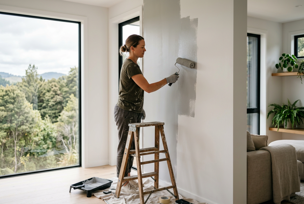
- Paint directly onto the wall in the actual room you're decorating.
- Apply two coats so the underlying colour doesn't bleed through and distort your reading.
- Make each swatch at least 30–40 cm square — small patches are hard to judge accurately.
- Test in multiple spots in the room: near a window, in a darker corner, and beside any fixed elements like cabinetry or trim.
If you're testing for an exterior, paint swatches on different aspects of the house (north-facing, south-facing) as sunlight intensity varies significantly.
Observe Colours at Different Times of Day
This step is one most people skip — and then regret. Light changes dramatically throughout the day and between artificial and natural light. A warm grey can look almost purple under LED downlights, and a crisp white can turn creamy in afternoon sun.
- Check your swatches in the morning, midday, and evening.
- View them under the artificial lighting you'll actually use (warm vs. cool bulbs make a big difference).
- Live with the swatches for at least two to three days before deciding.
New Zealand's light — particularly in the South Island — tends to be cooler and clearer than many overseas environments, which is worth keeping in mind if you're referencing overseas colour inspiration.
Use Resene's A4 Drawdown Sheets
Resene offers a handy option called A4 drawdown sheets — pre-painted colour samples on a larger card that you can move around the room. These are useful for getting a sense of a colour before committing to a testpot, and Resene ColorShops stock a wide range. They're not a full substitute for painting on the wall, but they're a great first filter when you're narrowing down a shortlist.
Consider the Undertones
Every paint colour has undertones — subtle secondary hues that become more visible depending on what's around them. A white with a yellow undertone will look warm and inviting next to timber floors but can clash with cool-toned tiles. When testing:
- Hold your swatch next to fixed elements in the room: flooring, benchtops, cabinetry, and soft furnishings.
- Compare your shortlisted colours side by side on the same wall.
- Be aware that dark colours can make a room feel smaller and may require more coats — factor this into your budget.
Don't Forget the Finish
Colour isn't the only variable — sheen level changes how a colour looks and performs. The same colour in a flat/matte finish will look noticeably different from the same colour in a semi-gloss. Common finishes include:
| Finish | Best Use | Light Reflection |
|---|---|---|
| Flat / Matte | Ceilings, low-traffic walls | Low |
| Low Sheen / Eggshell | Living areas, bedrooms | Low–Medium |
| Semi-Gloss | Kitchens, bathrooms, trim | Medium–High |
| Gloss | Doors, trims, exterior joinery | High |
For wet areas like bathrooms, make sure you choose a paint rated for that environment — BRANZ guidance and the NZ Building Code's E3 provisions around moisture management are worth keeping in mind when selecting products.
Exterior Colours: Extra Considerations
For exterior painting, colour choice has practical as well as aesthetic implications:
- Dark colours absorb more heat, which can affect some cladding materials — check manufacturer guidance, particularly for fibre cement products from brands like James Hardie.
- Some local councils or body corporates have colour restrictions, especially in heritage areas. Check with your local council before committing.
- Test swatches on different elevations and check them at different times of day, as described above.
When to Call a Professional
Colour selection is something most homeowners can handle themselves, but if you're planning a full interior or exterior repaint, a professional painter brings real value. They can advise on surface preparation, the right products for your substrate, and how many coats you'll actually need — which affects the final colour result significantly. Poor prep is one of the most common reasons a paint job fails or looks patchy.
You can find qualified, local painters on tradedirectory.co.nz who can help with everything from colour advice through to a flawless finish.